
Graphic Design
Graphic Design
BRANDING
Ontwerp de branding voor Hart voor Burn-out, een bedrijf dat mensen helpt met (het voorkomen van) burn-outs. De branding omvatte het ontwerp van een logo, een visuele identiteit inclusief flyer en ansichtkaarten. De stijl moest moderne, betrouwbare en zorgzame waarden weerspiegelen.


Graphic Design
BANNER DESIGN
Acutus had op korte termijn een bannerontwerp nodig. Door snel te handelen hebben we in twee weken tijd een bannerontwerp kunnen realiseren. Dit omvatte ook feedback rondes. Ik heb Acutus ook geadviseerd waar zij de banner konden bestellen. Ik geef mijn klanten altijd een ontwerp waarmee ze de producten direct zelf via derden kunnen bestellen.
Graphic Design
MVCI TOOL
Een collega van mij vroeg of ik hem kon helpen met het ontwerp van een infographic die hij maakte om startups te helpen. De eerste versie van de infographic was chaotisch en moeilijk te begrijpen. Door de tool te vereenvoudigen en de essentie ervan te vinden, heb ik de MVCI-tool opnieuw gestructureerd en er een visuele identiteit voor gemaakt. Het was een samenwerkingsproces waarbij we samen de strategie en inhoud van de infographic bespraken, en ik het grafische ontwerpgedeelte uitwerkte. De infographic is gemakkelijk te begrijpen en biedt een goed overzicht voor startups.
Kijk op www.mvci.tools voor de tool.


Graphic Design / Product Design
De grafische taal vertalen naar een nieuw product
Bij het vak Graphic language of products leerden we 2D, 2.5D en 3D merkelementen te herkennen. Het doel van het project was om de grafische merktaal van Breitling horloges te vertalen naar een nieuw hoofdtelefoonontwerp. Deze hoofdtelefoon moet eruit zien en aanvoelen alsof hij van het merk is. Het proces omvatte het analyseren van de merkkenmerken en -waarden op verschillende manieren. Verder hebben we een nieuw ontwerp met Breitling-elementen verkend met behulp van het Most Advanced Yet Acceptable (MAYA)-principe.
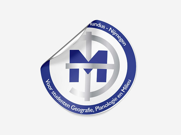
Graphic Design
REDESIGN MUNDUS LOGO
Mundus is een studievereniging voor de studie sociale geografie van de Radboud Universiteit. Ze hadden een verouderd logo en hadden behoefte aan een frisser en moderner logo, terwijl het er nog steeds uitzag als het oude logo. Samen met het nieuwe vernieuwde logo heb ik ook stickers voor ze gemaakt.

Graphic Design
KERSTKAART
Deze kerstkaart weerspiegelt de stad waar de opdrachtgever woont, Nijmegen. De kaart heeft een moderne illustratiestijl met kenmerken uit Nijmegen. Zo zijn de Waalbrug, het Waalstrand, stadskenmerken en een muur uit de Romeinse tijd meegenomen. De kaart is gedrukt op gerecycled kraftpapier en de inkt is van (eerlijke) sojabonen.
Graphic Design
VERSLAG LAYOUT ONTWERP
Dit rapport laat het proces en de resultaten van mijn masterproef zien. Het rapport weerspiegelt mijn georganiseerde en minimalistische ontwerpstijl waarbij een consistente visuele identiteit wordt gebruikt. Het proefschrift betrof het onderwerp verpakkingsontwerp, daarom zijn verpakkingsillustraties geïntegreerd in de lay-out. Het rapport bevat veel geïllustreerde schema's die onderzoeks- en ontwerpmethoden en theorieën visueel weergeven.

Packaging Design


Packaging design
TONY CHOCOLONELY VERPAKKINGSCONCEPT
De opdracht was om een verpakking te maken met daarin een food en non-food product. Ik heb ervoor gekozen om voor Tony Chocolonely een verpakking te ontwerpen die Tony's chocoladereep en chocoladesnijder bevat. De Nederlandse markt was de doelgroep. Het uiteindelijke concept resulteerde in een speciale hagelslag-editie met die-cuts openingen. Een noodalarm 'breek het glas' was de inspiratie. Het verwijst naar Tony's mission statement, we moeten de chocoladeproductiewereld alarmeren om de slavernij te bestrijden. Het voorstel omvatte uitgewerkte beschrijvingen van productietechnieken, materiaalkeuze, kosten inschatting, secundaire en tertiaire verpakking.
Het doel was om voor Maggi een nieuwe duurzame verpakking te ontwerpen voor verschillende snacks. De verpakking moet aansluiten bij de huidige levensstijl waarbij deze snacks makkelijk te bereiden moeten zijn. De kartonnen bekers zijn makkelijk in gebruik, handig om mee te nemen en gemaakt van FSC hout. Het concept voorziet in de behoefte van de gebruiker om de snack overal mee naartoe te nemen.
BNO PACKAGING AWARD 2019
Packaging design


Packaging design
MULTI ZINTUIGEN VERPAKKING
Design kan met meerdere zintuigen worden ervaren, maar hoe? In dit onderzoeksproject hebben mijn team en ik onderzocht hoe we een mes met oprechte kenmerken kunnen ontwerpen. Door middel van een doe-het-zelf mes moeten gebruikers voelen hoe oprecht een mes en zijn materiaal kan zijn. De verpakking was zo ontworpen dat het de gebruiker zou begeleiden bij het bouwen van het mes en vervolgens bij het maken van de hoes voor het mes. De verpakking maakt gebruik van materialen met texturen om naast de visuele zin ook meerdere zintuigen te stimuleren.

Bart heeft het vak voor imker zijn geleerd van zijn opa. Nu is hij zelf imker en produceert hij heel wat honing met zijn vijf bijenvolken. Authentiek, oog voor de natuur, puur, eerlijk en niet te vergeten Brabantse trots waren de uitgangspunten voor dit ontwerp. Op een speelse manier vertelt het label het verhaal van de vijf bijenvolken die ieder een eigen bijenkas hebben op het label. Ook maakt Bart zijn eigen honing mead. Het ontwerp moest worden doorgetrokken naar zowel een honingpot en een wijnfles voor de mead.
BART'S BIJEN
Packaging design


User Experience
UX Design / Graphic Design
GEBRUIKERSREIS
Het doel van het vak Brand Management was om een merk naar keuze te analyseren en iets te ontwerpen om de klantervaring te vergroten of te verbeteren. Om Starbucks te analyseren gebruikten we methoden zoals Customer Journey map, Archetypes, Persona's en User Centered Design. Ons laatste voorstel was een koffieproeverij. Een manier om de verschillende bonen mogelijkheden bij Starbucks te leren kennen, bewustzijn te creëren voor hun duurzaamheidsdoelen en mensen een ervaring te bieden die een must is om te delen. De koffieproeverij wordt geleverd met een mooi bord waarop de verschillende bonen en koffieshots worden gepresenteerd, samen met een boekje met gedetailleerde informatie.

UX Design / UI Design
INTERACTIEVE WEB INFOGRAPHIC VOOR KIDV

De combinatie van consumentengedrag en duurzaamheid zit er bij bedrijven vaak nog niet in. Om hen te helpen heb ik een toolpack gemaakt waarin praktische kennis centraal staat. Het gereedschapspakket bestaat uit drie delen. Een Cues Cube is een fysiek hulpmiddel om de interesse voor het onderwerp bij collega's op te wekken. Ten tweede geeft een interactieve infographic op de website van het KIDV meer inzichten vanuit consumentenperspectief. Ten slotte is er een theoretisch rapport gemaakt om bedrijven perspectief te bieden voor meer diepgaande inzichten en strategieën. In totaal biedt het toolpack verschillende manieren om op een speelse, visuele en gedetailleerde manier inzichten op te halen. Deze projecten betroffen een onderzoeks- en ontwerpgedeelte. Het onderzoek werd goed ontvangen en is gepubliceerd als een onderzoeks paper tijdens internationale verpakkingsconferentie Iapri 2022. Daarnaast is de tool gepubliceerd op de KIDV-website waar bedrijven de tool kunnen bekijken en gebruiken. Tijdens deze thesis heb ik veel geleerd over duurzame verpakkingen en consumentengedrag in relatie tot verpakkingsontwerp.

UX Design / UI Design
NATURE MODE APP
In dit onderzoeks- en ontwerpproject hebben we een ontwerp interventie gemaakt die helpt tegen sociale angst. De ontwerp interventie is ontwikkeld op basis van een eigen ontworpen psychologische model met theorieën. Er is een gebruikersonderzoek (enquête) uitgevoerd om betere gebruikersinzichten te krijgen. Inleving in de gebruiker is een belangrijk aspect in elk ontwerpproces. Er is een app ontwikkeld genaamd Nature Mode, waar ik het interface-ontwerp heb gemaakt. Kunstmatige natuurbeelden en ademhalingsoefeningen zijn in de app geïntegreerd om de gebruiker bewuster te maken van zijn angsten.
UX Design / UI Design
LANDING PAGE MVCI TOOL
De MVCI-tool is een infographic voor startups. Het is gemakkelijk te begrijpen en geeft een goed overzicht van alle ins en outs van het starten van een eigen bedrijf. De tool is gratis en toegankelijk via een landingspagina. De landingspagina geeft een korte introductie over de tool, biedt downloads en een feedbackformulier is geïntegreerd. De landingspagina weerspiegelt de speelse, professionele en minimalistische look en feel van de MVCI. Kijk op www.mvci.tools voor meer.